You couldn’t stop thinking about it—even though no one asked for it, no client was paying, no boss was breathing down your neck, and React wasn’t even required?
Yeah, that’s exactly how my real-time solar flare monitor started.
Just me, a bunch of NASA docs, and way too much coffee on a weekend when I should’ve probably been sleeping or socializing.
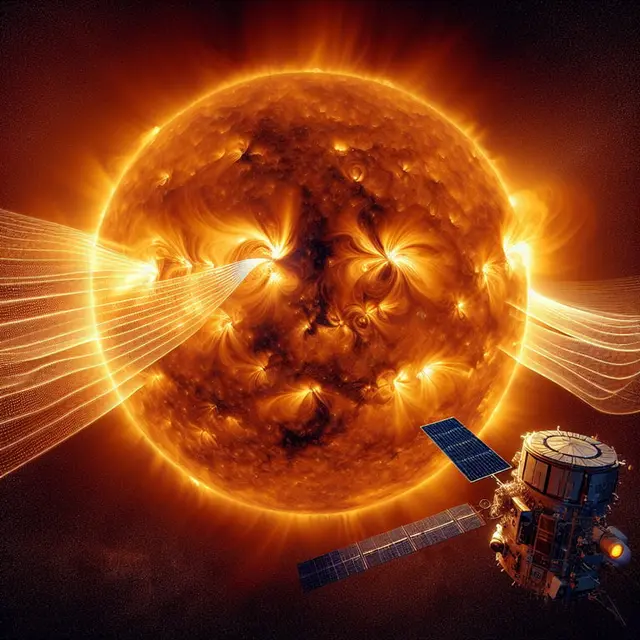
But here I am in 2025, and I’m still obsessed with space weather.
More specifically—solar flares.
It Started with a Rabbit Hole… and Led to a React Dashboard
A few months ago, I stumbled on a random Reddit thread.
Some amateur radio guy was complaining about signal blackouts and said:
“Thanks, solar flare!”
I froze. Like… wait, what?
Solar flares can mess with radio?
Cue the rabbit hole.
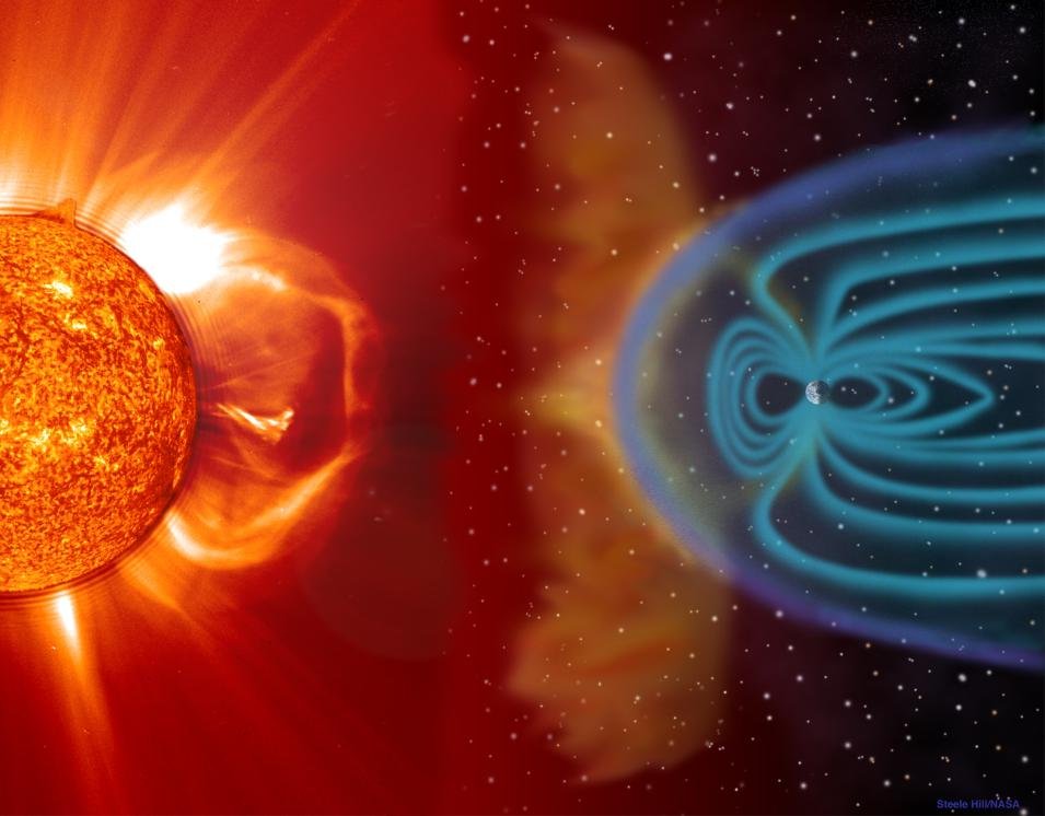
Turns out these bursts of radiation from the sun can wreak havoc on:
- GPS
- Communication satellites
- Airline routes
- Even the freakin’ power grid
Like, actual consequences.
And yet… no real way to see this data live unless you check some clunky government website that looks like it hadn’t been updated since 2009.
So I thought—why not build something better?
- Something simple
- Something visual
- Something real-time
- Something built in React (because that’s still my happy place)
- Powered by live NASA data
NASA APIs and React: Intimidating at First, Then Kinda Magical
Okay, so—NASA’s data is public (bless them), but working with their APIs is…
Let’s just say not super beginner-friendly.
Like most government data sets:
- The structure is rigid
- The documentation is thin
- And if you’re expecting pretty JSON with all the fields explained—lol, no
The first two nights were rough.
I was up past midnight trying to figure out the difference between SXR and M-class flares.
I’m no astrophysicist—I’m just a dev who builds dashboards. But eventually, I got it.
Trial. Error. Stack Overflow. Caffeine.
And then—boom.
My first successful fetch.
A tiny blip of radiation activity, timestamped and tagged.
It wasn’t much, but it felt like I’d just unlocked a secret message from the sun.
Visualizing the Sun’s Mood with React
Once the data was flowing, the next part was weirdly fun: deciding how to show it.
You’d think building data dashboards would be dry, right?
But when the data is literally from a star 93 million miles away—it suddenly feels… poetic?
I wanted the UI to feel alive. Like a pulse.
- Every time a solar flare was detected → a glowing dot would pulse on the screen
- Bigger flares → bigger pulses
- A timeline of past events → almost like reading the sun’s diary
I remember the first time I saw an X-class flare pop up on my dashboard.
I kid you not—I whispered “whoa” out loud to no one.
That flare had the potential to disrupt half the satellites over the Pacific.
It was surreal.
The Real-Time Struggles (aka “Is this thing even working?”)
Here’s the part people don’t usually talk about when they show off shiny projects:
The quiet panic when things just… stop working.
Solar flares aren’t exactly predictable.
Sometimes there’s nothing for hours. Or days.
I kept refreshing the dashboard, convinced I broke something.
There were times I doubted the whole project.
“Why am I building this again? No one’s gonna use it.”
But every time a new data point came in, it felt like a high-five from the universe.
Also: timezones.
NASA timestamps are in UTC. My browser time is, well, local.
It took longer than I’d like to admit to align them properly.
Unexpected Learnings
- Space is not quiet.
I always thought of it as calm and still.
But our sun throws giant tantrums, and they can reach us in minutes. - People actually want this.
I casually posted a GIF of my dashboard on Mastodon.
Ham radio operators, storm watchers, and even a pilot messaged me asking for the link. - APIs are only half the battle.
The real magic is turning raw numbers into something that makes you feel.
A graph is just data.
A flare animation? That’s storytelling.
What It’s Used for Now
Honestly? My solar flare monitor isn’t revolutionary.
It doesn’t control satellites or reroute planes.
But it makes invisible things visible.
And for people in fields like:
- Radio
- Aviation
- Astronomy
…that matters.
Teachers have reached out saying they used it in class to explain solar activity.
One even said:
“My students never cared about the sun before. Now they watch it like weather.”
That hit me hard.
This little side project became a bridge between data and curiosity.
What’s Next?
I’m thinking of adding solar wind data next.
Maybe tie it into a forecast model—like a “mildly cranky sun” alert or something.
I also want to archive major flare events and see if there’s a pattern before/after them.
Just out of nerdy curiosity.
But mostly? I want to keep building tools that make complex stuff a little more human.
Conclusion
I didn’t build this for a company. Or a paycheck.
I built it because the sun felt too big to ignore—and too cool not to watch.
So if you’re reading this and thinking:
“I’ve got an idea like that, but I don’t know if it matters…”
Read our more blogs-Building a Real-Time Aurora Visualizer with Three.js and NOAA APIs

Pingback: 2025 Review of Superintelligence - Bridge Group Solutions