The Value of Simple, Real-World Tech
Sometimes, the most impactful tech projects aren’t flashy—like using Grafana to visualize real-time data that actually helps people make smarter decisions. They don’t chase the latest hype cycle. They just solve a problem that affects everyone—like understanding how much water is left underground before it’s gone.
That’s the heart of this project: keeping tabs on groundwater before wells run dry or panic sets in.
It sounds simple. But building a system that monitors groundwater in real time? It never feels that way when you’re piecing it together. So this isn’t a blueprint. It’s a collection of lessons—what works, what breaks, and what matters.
Why Bother with Real-Time Tracking?
Groundwater hides in plain sight. People assume it’s there—until one day the well runs dry. And by then, it’s too late.
Manual readings? They’re okay if you like guessing. Real-time sensors, though, remove the mystery.
In one small farming village, a few cheap pressure sensors told a clear story: no more debates over whether the water was falling. The graphs spoke for themselves.
What Makes Up the Whole Setup
There’s no single “correct” setup, but here’s what most people end up using after enough trial and error:
- Sensor: Ultrasonic or pressure-based—budget-friendly options work.
- Microcontroller: ESP32, Arduino, or Raspberry Pi.
- Connectivity: WiFi where it works, LoRa for remote setups.
- Database: InfluxDB is a common choice for time-series data.
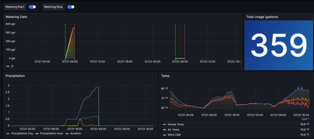
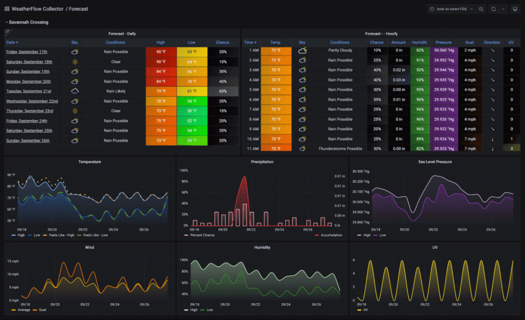
- Dashboard: Grafana to visualize everything.
One lesson: more fancy = more fragile. Simpler builds break less often.
The Part Where Everything Breaks
Nobody tells you how messy the early weeks are.
- The WiFi dies for no reason.
- The sensor shows “0” when the well is clearly full.
- A windy day shakes the sensor and produces data spikes.
One project duct-taped a pressure sensor to a PVC pipe. The wind moved it just enough to make the readings useless.
Then there’s calibration. You think it’s set forever—until a week later when readings drift by 10 cm. Turns out, temperature can skew the values. And that’s before anyone mentions power issues.
Grafana: Where Data Starts to Make Sense
Grafana looks intimidating at first—too many panels, too many options. But it gets easier.
Start simple:
- A line graph showing depth over time.
- A rolling average to filter out noise.
- A red alert panel that fires when levels drop dangerously low.
One project added SMS alerts. One night, a warning came through: the water had dropped 20% below normal. They scaled back irrigation in time. That early warning made a real difference.
What Usually Goes Wrong (And It Will)
Don’t expect perfection. Expect hiccups.
Common pitfalls:
- Power drain: Batteries fade faster than expected.
- Connectivity issues: Rural WiFi is unreliable. LoRa helps—but isn’t magic.
- Data gaps: Sometimes the logger just… stops. Plan for it.
- Sensor drift: Recalibrate occasionally.
If you prepare for problems, every fix feels like progress instead of frustration.
One Real Example: Community Well Monitoring
In a dusty village with one shared borehole, volunteers mounted a cheap ultrasonic sensor in the casing. A weatherproof box held the electronics. A microcontroller pushed data hourly.
For a while, nobody looked at the dashboard. Then a dry spell hit—and suddenly everyone wanted to see the graphs.
That transparency changed everything. People saw the same numbers. They rotated well usage and rationed early. Not because someone ordered it—but because the data made it obvious.
It wasn’t magic. But it felt close.
A Few Things That Helped Along the Way
- Keep local storage: If WiFi goes down, still log the data.
- Use Grafana annotations: Mark rain days or pump fixes.
- Test before deploying: Obvious, but often skipped.
- Teach people to read the graphs: If no one understands it, it’s useless.
Nothing high-tech here—just small habits that make the system usable.
Reflections on Sustainability and Simplicity
It’s tempting to over-engineer. Add AI. Fancy dashboards. Predictive models. But most of the time, simple is better.
A clean graph showing depth over time? That’s the kind of truth people trust. No spin. No guesswork.
And once people start watching water decline in real time, conversations shift. Mindsets change. People care more.
That alone makes it worth the hassle.
Conclusion
This isn’t glamorous work. Most days, it’s debugging cables, redoing dashboards, and wondering why the last reading looks off.
But then, one day, you open Grafana and everything just works.
The graph updates. The alerts fire. And the data tells a story everyone can see.
That’s the best part—turning something invisible like groundwater into something visible, something real. Something people can act on.
Read our more blogs-Creating a Real-Time Earthquake Damage Estimator with Cesium and Julia